PROJECT SCOPE
Branding:
Brand name
Primary and secondary logo
Logomark
Brand colour palette
Brand pattern
Brand style guide
Additional:
Social media marketing material
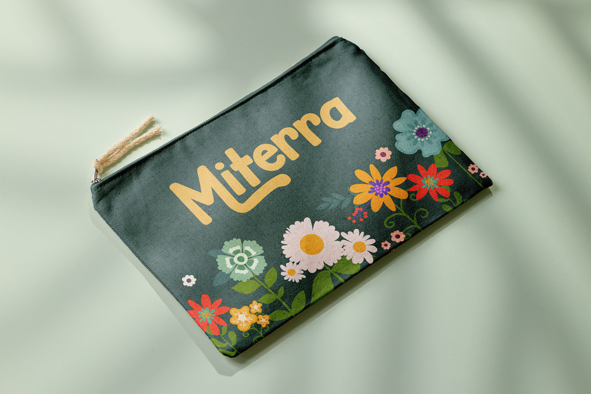
Merchandise
Packaging
BRIEF
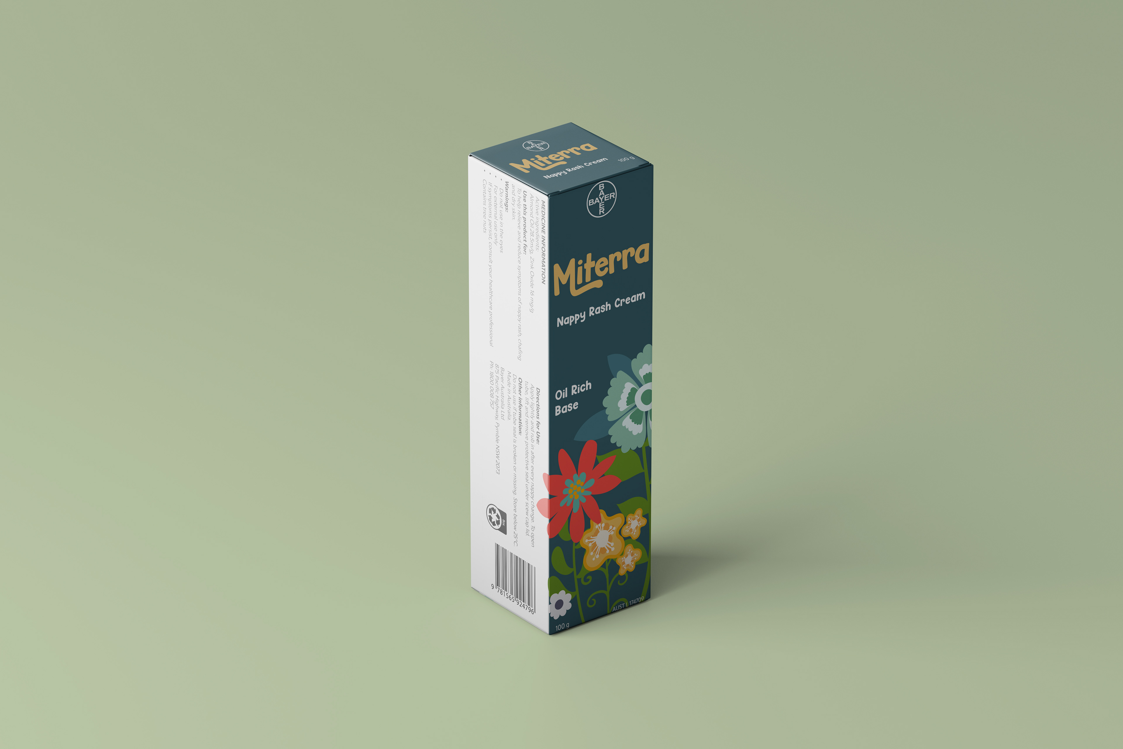
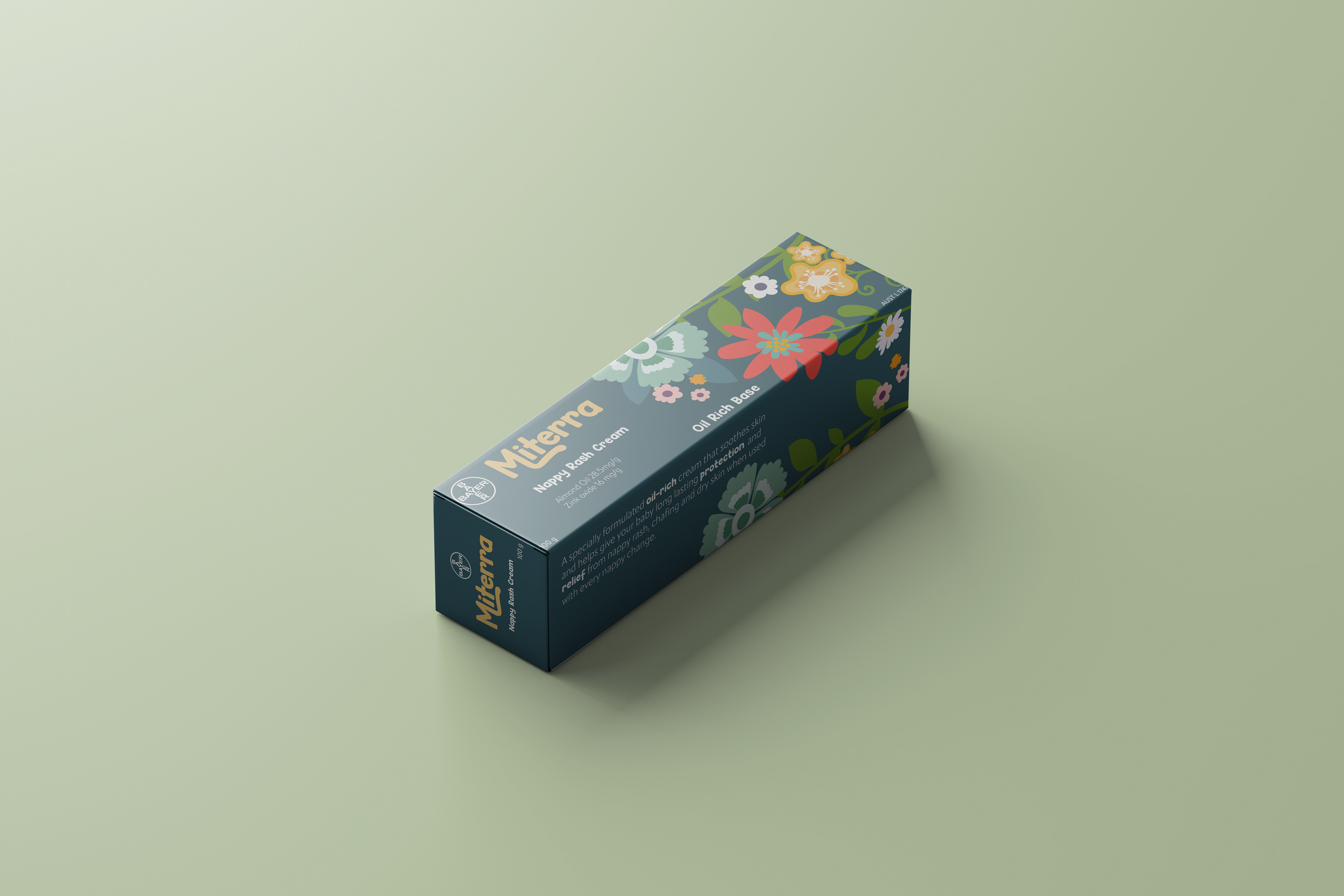
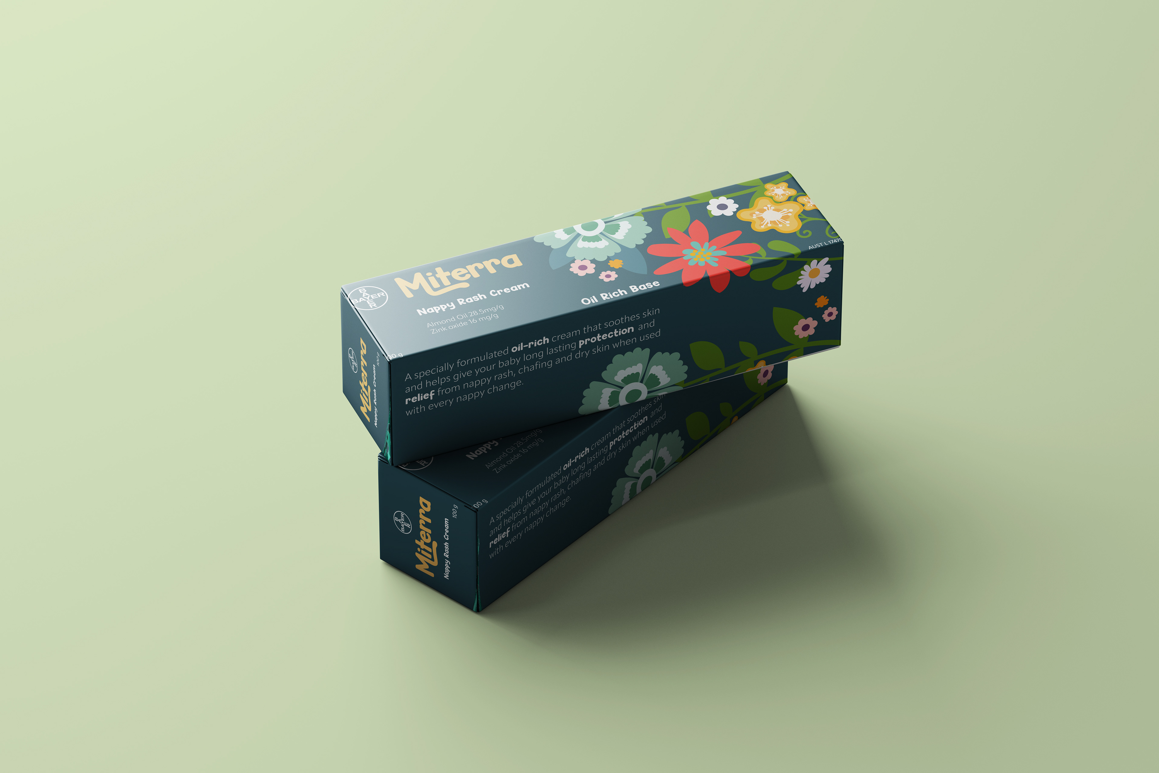
Miterra is a nappy rash cream that takes care of babies, and the earth.
The brand name Miterra is derived from the Latin translations of gentle and earth. The final Miterra logo is a custom wordmark. The logo incorporates san-serif letter forms, with a tail floating from the ‘M’ which extends under the logo. The soft edges of the letters and disparity of angles give a playful, gentle appearance in line with the brand voice. The mustard yellow is symbolic of the ‘golden hour’ where natural light appears most warm and humbling.
The packaging is designed to stand out amongst competitors, and to target the brands primary audience. It incorporates a bold colour palette with striking floral illustrations whilst incorporating all necessary information into an easy to read package.